The PageMotor Options Array Format establishes the syntax for delivering <form> inputs to the various PageMotor UIs (and to any custom UI you’d like to create with PageMotor, whether on the Admin side or the Front End).
The format covers the 6 core types of inputs along with their (optional) alternate states, where applicable:
- Text inputs:
text,password,email,url,search,tel - Color inputs:
color - Textareas:
textarea - Checkboxes:
checkbox - Radio selectors:
radio - Dropdown selectors:
select
In addition, the Options Array Format includes two more types useful for UI organization and refinement: group and custom.
Basic Options Array Syntax
Each option is declared as an associative array of data. Certain array keys within the syntax are common to all input types; others are relevant only to certain types. Here’s an example to illustrate the syntax:
'option-id' => array(
    'type' => 'text', // 'type' key is required
    'label' => 'Sample Option Label',
    'tooltip' => 'Helpful tooltip text',
    'description' => 'Helpful field description',
    'placeholder' => 'Input placeholder text',
    'required' => '*', // makes field required and uses this character indicator
    'readonly' => false, // set to true to make input read-only
    'disabled' => false, // set to true to disable input
    'default' => 'some value', // only relevant if 'readonly'
    'item-class' => '') // add HTML class to outer option wrapper
Only the type key is required for all input types, but an options key is also required for checkbox, radio, and select.
We will explore each option type in detail below, but first, let’s take a look at the HTML output for options to better understand how the PageMotor Options Array Syntax works. Here’s some output for a simple text input field:
<div class="option-item option-field" id="field-title">
	<label for="title">
		Site Title
	</label>
	<input type="text" class="text-input long" id="title" name="title" value="A Blazing Fast PageMotor Website">
</div>
- Each option is wrapped in a
<div>for the purposes of organization and CSS/JS targeting- This
<div>includes automatic class names as well as optional, custom class names defined by theitem-classkey outlined above - It also includes an
idattribute that follows the syntaxfield-[option ID], where[option ID]equals the outermostoption-idkey from the sample options array above
- This
- If provided, a
<label>will appear first within the wrapping<div>. Theforattribute tells browsers that this label belongs to the input with anidoftitle(this offers click-based benefits and helps both parsers and screen readers)- If the input field is
required, the required indicator will appear after the label text - If the input field has a
tooltip, a tooltip indicator will appear after the label text and (optional) required indicator
- If the input field is
- Finally, the desired input type is output in the HTML along with any other relevant information supplied in the options declaration
Now, let’s take a look at each input type.
Text Inputs: <input type="text">
Text inputs can have alternate sub-types to handle different input cases like emails or phone numbers. They are also subject to browser autocomplete rules, and for these reasons, text inputs have a few (optional) array keys that are not available to other input types.
// List of all valid text input array keys:
'sample-text-input' => array(
    'type' => 'text',
    'sub-type' => false, // optional: 'password', 'email', 'url', 'search', 'tel'
    'code' => false, // optional, true if the input is code instead of regular text
    'width' => false, // optional: 'tiny' (50px), 'short' (120px), 'medium' (200px), 'long' (400px), 'full' (100%)
    'label' => 'Option Label', // optional
    'required' => '*', // optional
    'placeholder' => 'Placeholder text', // optional
    'description' => 'Description text', // optional, appears underneath input unless 'width' is 'tiny'
    'tooltip' => 'Tooltip text', // optional
    'autocomplete' => false, // optional: 'on', 'off', or space-separated list of tokens like 'email', 'name', etc
    'disable' => false, // optional
    'readonly' => false, // optional
    'default' => 'default value', // optional, can only be used with 'readonly'
    'counter' => 'Counter description text') // optional, add a character counter to the input field
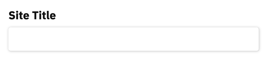
In practice, you’ll only need a few of these array keys to get your options to work the way you want. For example, to generate the HTML output presented earlier—which is used for the Site Title option in PageMotor—you only need this simple array:
'title' => array(
    'type' => 'text',
    'width' => 'long',
    'label' => 'Site Title')
And that results in an input field that looks like this:
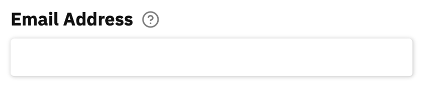
Using an input sub-type is similar. Here’s the options array for an email input field:
'email' => array(
    'type' => 'text',
    'sub-type' => 'email',
    'width' => 'long',
    'label' => 'Email Address',
    'tooltip' => 'Email addresses must be unique! Two accounts cannot share the same email address')
This results in an email field that will leverage the browser’s autocomplete function for email addresses. Also note the tooltip indicator next to the label; when the user clicks on the indicator, the tooltip will appear:
Color Inputs
Browser support for true color inputs (<input type="color">) is limited, so PageMotor uses a modified version of a text input to ensure widespread compatibility. The options code is designed in a way that, if browser compatibility improves, your existing color options will automatically be converted into the preferred input type.
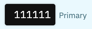
Here’s a sample color input from the Attention Theme:
'c1' => array(
    'type' => 'color',
    'width' => 'short',
    'description' => 'Primary')
This results in a simple color input field that displays the hex value of the selected color:
Note: For now, color input fields require pm-options and jscolor JS files to be loaded on the current page in order to function. Once browser compatibility for <input type="color"> improves, these files will no longer be necessary to get color inputs to work. With that said, if you want all your options to function properly (with tooltips, groups, and dependencies in particular), you’ll still need to ensure pm-options is loaded on the page(s) where your options appear.
Textarea: <textarea>
Options arrays for textarea inputs are nearly identical to text inputs, but with four notable distinctions:
- The
sub-typearray key is not supported - You can specify the number of
rowsyourtextareawill display autocompleteis not supportedwidthis not supported (as it’s assumed you want thetextareato fill the entire width of the parent container)
Other keys like disabled, readonly, default, counter, and even code are supported and will behave just like text inputs.
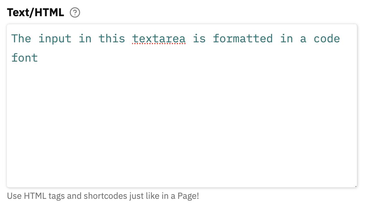
Here’s a sample textarea input from the Text Box Plugin:
'text' => array(
    'type' => 'textarea',
    'rows' => 8,
    'code' => true,
    'label' => 'Text/HTML',
    'tooltip' => 'This box allows you to insert plain text and/or HTML. All text will be formatted just like a normal Page, and all valid HTML tags are allowed.<br><br><strong>Note:</strong> PHP code is not allowed here.',
    'description' => 'Use HTML tags and shortcodes just like in a Page!')
This results in a large textarea with 8 rows visible on pageload and a code font enabled (because the input is supposed to be HTML code):
Checkboxes: <input type="checkbox">
Checkboxes are a unique input type for a couple of reasons: They only have 2 states—on or off—and they often appear in clusters where it would be inefficient and unreasonable to declare a new option for each checkbox.
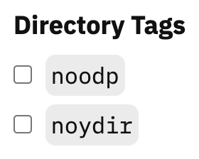
They also require an options key in the form of an array that defines the specific checkbox options that will appear in the UI. Here’s an illustrative example from the Meta Robots Plugin:
'directory' => array(
    'type' => 'checkbox',
    'label' => 'Directory Tags',
    'options' => array(
        'noodp' => '<code>noodp</code>',
        'noydir' => '<code>noydir</code>'))
Here’s what this declaration looks like in the PageMotor UI:
Note how only one option ID—directory—is necessary to generate multiple checkboxes. But because of this, checkboxes require different treatment in terms of how they are referenced in output code.
The outer option ID—directory in this case—must be used as the gateway to access the on/off state of interior options. So in order to reference the state of the noodp checkbox, you would need to do something like this in your output code:
$this->site_options['directory']['noodp']
But because checkbox values can be empty, you actually need to institute a couple of “existence” checks in order to comply with PHP standards:
if (!empty($this->site_options['directory']) && !empty($this->site_options['directory']['noodp']))
    // Do something because noodp is checked
Radio Inputs: <input type="radio">
Just like checkboxes, radio inputs require an options key. But unlike checkboxes, the values of radio inputs can be referenced directly by using the option ID. I’ll illustrate this below, but first, let’s look at an example radio input options array:
'link' => array(
    'type' => 'radio',
    'label' => 'Link Site Title?',
    'options' => array(
        '' => 'No link',
        'home' => 'Link to home page'))
This results in a radio input with two options:
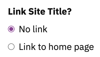
Radio inputs have constrained values; they can only be equal to the array keys of the options you provide (in this case, empty or home).
To reference them, you should check if the option ID is empty, and then, if necessary, check to see if the value of the option ID equals one of your options array keys. Using the example code from above, a reference would look like this:
if (!empty($this->site_options['link']) && $this->site_options['link'] == 'home')
    // Do something because 'home' is selected
Dropdown Selectors: <select>
Just like checkboxes and radio inputs, dropdown selectors require an options key in order to function. And they behave similarly to radio inputs in the sense they can only have values equal to the keys defined in the options array.
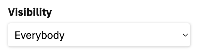
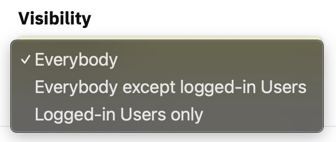
Here’s a sample select option from the Modular Content Plugin:
'users' => array(
    'type' => 'select',
    'label' => 'Visibility',
    'options' => array(
        '' => 'Everybody',
        'off' => 'Everybody <em>except</em> logged-in users',
        'on' => 'Logged-in users only'))
And here’s the resulting dropdown selector in its default state and then activated:
Referencing select data is identical to referencing radio data. Check if the option ID is empty first, and then check its value if it’s not empty:
if (!empty($this->site_options['users'])) {
    if ($this->site_options['users'] == 'off')
        // Do not display to logged-in users
    elseif ($this->site_options['users'] == 'on')
        // Only display to logged-in users
}
else
    // Display to everybody
Best practice tip: You should always seek to minimize the amount of data necessary to do whatever it is you’re trying to do. With this in mind, your first option for both radio and select inputs should be empty. All other options should have values; this ensures data will only be saved if anything other than the first option is selected.
Option Groups
Designed for better UI management, option groups can be used to group various options together into sections. These sections can then be targeted with CSS or JS to yield different UI outcomes.
Groups function as “wrappers” for PageMotor Options, which are themselves groups of options presented in the PageMotor Options Array Format.
Option groups can use the following array keys:
'options-group-id' => array(
    'type' => 'group', // required
    'label' => 'Group Label', // optional
    'fields' => array(), // required, PageMotor Options Array Format
    'class' => false, // optional, class to add to group wrapper
    'description' => 'Group description') // optional, appears beneath label but before group output
The fields key is critical, and it should include an array of options in PageMotor Options Array Format (hence the “wrapper” designation for option groups).
If you include a label, your resulting group will automatically include a toggle switch to show/hide the grouped options (and the options will be hidden when the UI loads).
In many (most?) cases, you’ll probably want to omit the label key, as the organization of options doesn’t automatically call for a label. For example, options groups are used in both the Content Options and the Theme Design Options, but neither scenario includes group labels.
Custom Options
Custom options exist so you can add any kind of HTML you want to your forms. The following keys are valid for custom options:
'custom-option-id' => array(
    'type' => 'custom', // required
    'label' => 'Custom Option Label', // optional
    'class' => false, // optional, class to add to custom option wrapper
    'html' => '<p>Any HTML output you want</p>') // optional but likely essential
Custom options are perfect for breaking up your forms with headings or adding descriptive text in the form of callouts. The headings in the Theme Design Options are delivered with custom options:
And so are the descriptive callouts in Modular Content Box Options:
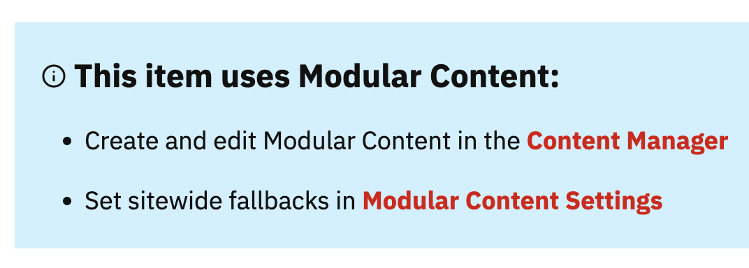
The example from Modular Content is somewhat complicated but also useful for understanding how much flexibility you have with custom options:
'info' => array(
    'type' => 'custom',
    'html' =>
        "$tab<div class=\"callout note\">\n".
        "$tab\t<h4>\n".
        $motor->tools->svg->icon('info', $depth + 2).
        "$tab\t\tThis item uses <strong>Modular Content</strong>:\n".
        "$tab\t</h4>\n".
        "$tab\t<ul>\n".
        "$tab\t\t<li>Create and edit Modular Content in the <a href=\"". ($this->admin_theme ? $motor->admin_url('admin-content') : $motor->admin_url('content')). "\"><strong>Content Manager</strong></a></li>\n".
        "$tab\t\t<li>Set sitewide fallbacks in <a href=\"". $motor->admin_url('plugins'). "\"><strong>Modular Content Settings</strong></a></li>\n".
        "$tab\t</ul>\n".
        "$tab</div>\n"),
In the code above, $depth and $tab are defined before the options are invoked, and the $motor global has also been pulled in beforehand.
But this example illustrates how you can deliver precisely-tuned HTML output inside custom options to enhance your forms. It can be as simple or as complicated as you need.
Options Dependencies
Checkboxes, radio inputs, and dropdown selectors are natural candidates for options dependencies, as their current state can sometimes determine whether or not other, related options should appear in the UI.
To illustrate how this works, let’s look at an example from the Page Date Plugin included in PageMotor. Under the Display Settings label, there are two checkboxes that control what will display along with the Page Date:
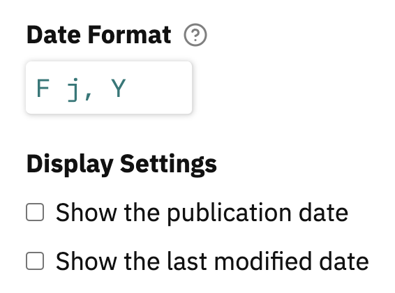
When either one of those checkboxes is selected, another related option will appear:
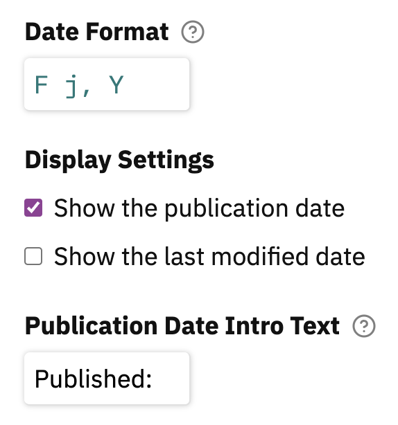
This works because of a 2-way relationship established in the options declarations. The checkboxes declare dependents, and the intro text options declare a parent. Here’s what that looks like:
'show' => array(
    'type' => 'checkbox',
    'label' => 'Display Settings',
    'options' => array(
        'published' => 'Show the publication date',
        'modified' => 'Show the last modified date'),
    'dependents' => array(
        'published',
        'modified')),
The show checkboxes have an array of dependents. Each item in this array translates to, “if the current option is checked, show any options that declare this option as its parent.”
Now here’s the other half of the equation:
'intro' => array(
    'type' => 'text',
    'width' => 'short',
    'label' => 'Publication Date Intro Text',
    'tooltip' => 'Any text you supply here will be wrapped in HTML',
    'parent' => array(
        'show' => 'published')),
'intro-modified' => array(
    'type' => 'text',
    'width' => 'short',
    'label' => 'Last Modification Date Intro Text',
    'tooltip' => 'Any text you supply here will be wrapped in HTML',
    'parent' => array(
        'show' => 'modified'))
Both the intro and intro-modified options declare a parent array. For intro, that array looks like this:
'parent' => array(
    'show' => 'published')
This says that if the published checkbox is selected for the show option, then the intro option should appear in the UI.
For modified, the parent array looks like this:
'parent' => array(
    'show' => 'modified')
Similarly, this says that if the modified checkbox is selected for the show option, then the intro-modified option should appear in the UI.
Note: If any option declares a parent, it will not appear in the UI unless the parent option is set to the designated state in the UI.